Strengthen Your Presentation Using The Right Image.

Our human nature is largely sensitive to the visual factors around us. We are exposed to visuals and information bombardment that equals to 174 newspapers every day in today’s digital and physical world which is full of visuals that we cannot escape. In the 1950’s, graphics and photography were common in the world of communication, and in the 21’st century, we have a wider memory covering infographics, 3D visualizations and virtual reality. For this reason, many details such as visual use, visual connection, visual attractiveness for the user, usage in the design become important equations which must be solved in order to be remembered.
Whether it is a yearly budget plan presentation to our executives or a product launch, the purpose of each presentation is the same: to stick in the mind of the audience. Of course, we cannot rule out that the presenter’s personal skill is a very important factor. But the overall success of the presentation comes from a combination of strong, professional expressions and visual design that can touch the emotions of the audience.
True and on-the-spot visuals allow the audience to trust, interest, and be curious in you and your presentation, while false or inadequate visuals create insecurity in the audience and cause them to break out of focus from the presentation. Presentation designer comes out right here. They provide you with a network of communication between the presentation and the audience, with the right, accurate and impressive visuals. Thus the words that spill into the language do not fly away.
How can we be sure that we choose the right visual? How does correct image ensure that the presentation you are designing is really powerful and effective? Let’s try to find a good answer to these questions.

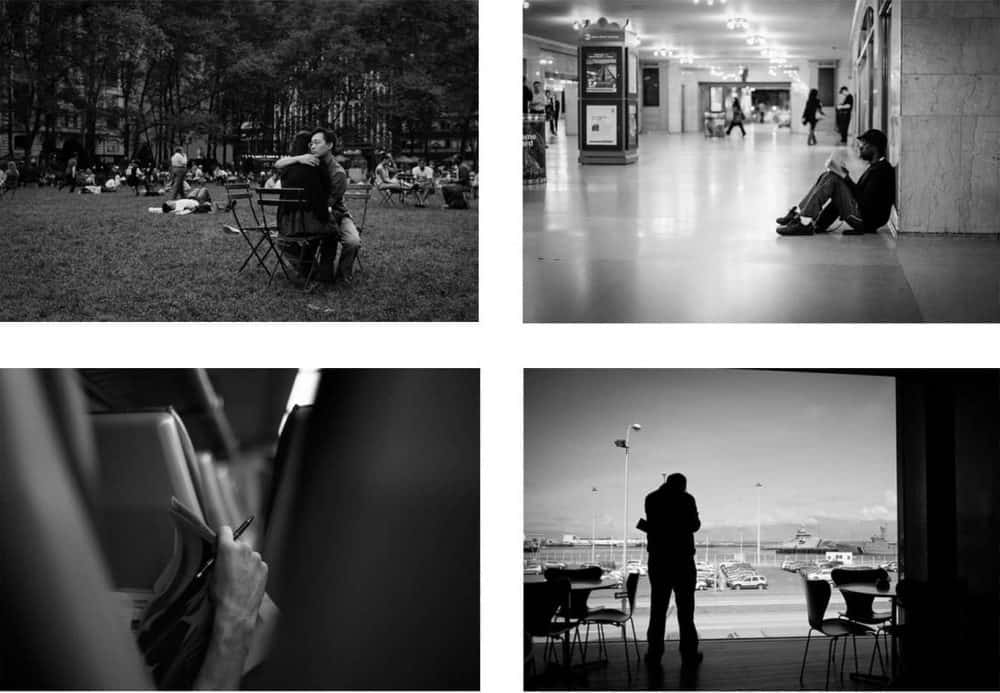
Make a difference using images which tell stories
It just is not enough for a photograph to appear in our presentation. Instead, you should prefer visuals that tell a story, evoke a certain emotion in the audience, and highlight your message. So you can encourage your audience for an emotional connection with your presentation. You can make a difference by selecting the photos to be used in PowerPoint or Keynote among intimate and engaging storytelling ones that supports your narrative.

Use plain and bold images
When you are researching for visuals that you will use in your presentation, keep looking until you find an option that really makes a difference, rather than choosing the first photograph that will work. Regardless of type and size, you need to use remarkable visuals.
Tip: Though simple at first glance, uncomplicated visuals are the most impressive ones.
Avoid distracting yourself from overly complex or intense pictures. If you are trying to give a large number of messages with one image, specify the most important item on the presentation page and support this item with a simple visual aid. Such visuals will allow you to remain true to what you are describing after your presentation is over.
If your presentation involves a very complex subject, it is more important to focus on simplicity and clarity. Simple visuals provide space for resting and getting your message.

Highlight your words using photos
While using images on presentations, we target not only to aesthetically strengthen them, but also to make it easier for audience to follow the presentation. Each photo used should highlight your words and help audience understand you better. For this reason, it is a wrong step to choose an image irrelevant to the context just because it is beautiful. From time to time it is helpful to use supporting visuals that slow down the presentation’s flow, but in general, the images should contain touches of information you give.
What you should never forget is that your presentation and images must support each other strongly. To test this, you can ask yourself the following question: “What information does this image give about what I say?” If the answer overlaps with your content, then you have the right image!
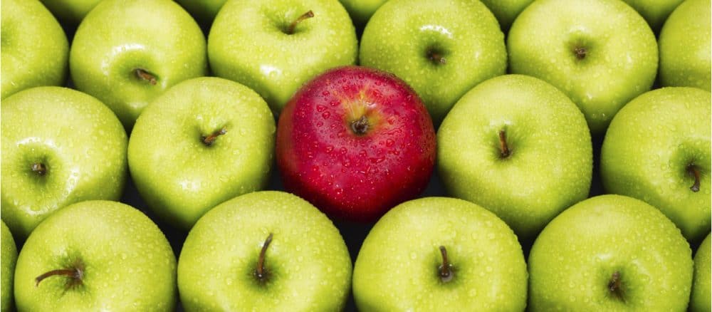
Select unique images
It is very obvious that some photos are not exclusive to you, but are selected from websites sharing stock photos, or selected from the first rankings in search engines. Result: the presentation loses its originality and becomes boring.
Whenever you choose an image for your presentation, try to use original ones if possible. For example, you can use high-quality original photos that come directly from your company, or you can choose non-generic and overlapping ones with what you really talk about. Try to remember how often you see similar images to make sure you choose the original image. Look for similar visuals by searching the images on search engines. If you feel that the image you choose is ordinary, it means you have to continue looking for a better one.
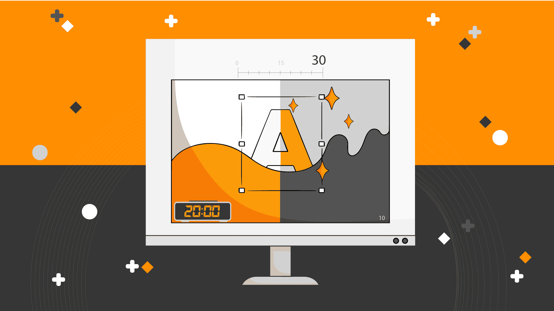
Pay attention to consistency and high resolution
Using perfect photos that are totally independent from each other does not make your presentation more impressive. Choose consistent images with each other as you complete a series. In addition to this, it is important to choose photos with high resolution in order to add vibrant and understandable visual quality to your presentation. Trying to enlarge a small image in PowerPoint to make it bigger means sacrificing quality.
Use high resolution image files taken by professional photographers wherever possible. Note that the quality of the images on the screen gives a message about the quality of your wisdom. If you use amateur pictures, people will probably assume that you are an amateur.
Note: On Flickr and Google Images you can find consistent and high-resolution images that you can use as a series.
Images enable the audience to remember and the speaker to focus
Visual perception helps people remember the subject described in full detail when supported by speech overlapping with context. Thanks to image use, the speaker uses gestures and mimics more comfortably. This mobility allows the speaker to better control the presentation. Thus, the visuals are useful for both the listener and the speaker at the same time.
Which images should be chosen and used for a good presentation
For all corporate presentations, you should use simple and meaningful images so that the audience can easily follow the speech. Instead of abstract styles, geometric illusions, you have better use real photographs and minimalist designs to create effective slides. A thematically tailored presentation will make it easier for your audience to connect emotionally to your presentation.
Be brave when it comes to presentation design
It must be mentioned that original styles of visualization can be remembered more easily than common styles and templates. The presentation must be designed exclusively for the speech and event because there is no general presentation template fitting all. Whether it is a budget presentation consisting of extensive data or a launch presentation addressing to thousands of people determines the context of design with their different contents. That is why you should be brave enough to allow the designer to handle your message in the most personal way possible, and make sure that your presentation is as clear as possible.
Result
Giving a presentation a visual dimension ensures the overall success of the presentation. The images increase the acceleration of the words and improve the conveyance of the narrative that the presentation aims. Clear, simple and meaningful images reinforce the conception in the audience’s mind. The trick for creating a good presentation is to know and understand the purpose of each component.