7 Tips For A Seamless Presentation Design.

Today, when you invite people to watch a presentation, they tend not to go unless they have to. The reason is mainly the common prejudice: presentations – especially corporate presentations – are boring and unnecessary. You need to persuade people that you will make a really functional and engaging presentation and to work hard to end up with a seamless presentation design.
We go through years when we are exposed to visual data and information overload. It is not hard to imagine that you need to appear before people with a delightful and interesting presentation design, considering that people to watch your presentation would be tired of seeing the same images everywhere – just like you. Otherwise, people will listen to you just because they have to and will not remember much afterwards.
On the other hand, it is not a myth or a dream to design a presentation that will meet the needs, attract people and motivate them to listen. You can make a big difference with a presentation that does not go out of the audience’s mind for years when you follow certain rules and add some creativity.
Now that we know the problem, let’s look at the ways to solve it. Below I put together 7 tips that will make your presentation design seamless and impressive.
Enjoy it!
Source: www.behance.net/pollet_florian
Forget ready-to-use themes and reflect your own spirit
Whether it’s PowerPoint or Keynote, using a ready-to-use theme is not useful for adding originality to your presentation. It is very difficult to create the effect you want with tedious presentation designs that your audience has repeatedly encountered. Instead, with a simple, pleasant and original design, you start your presentation 1-0 ahead.
Of course, we cannot deny that the number of ready-to-use presentations is increasing frequently, and from time to time we are confronted with seemingly agreeable designs. However, every inviting presentation will not be suitable for you; and many people may have felt that way you do for the very same presentation. This may cause your presentation to be inadequate to reflect your or your company’s spirit. You can consider using these presentation designs only if you have to make a presentation in the last minute or you have a really short time.
What I want to highlight here is that the expression of a presentation designed specific to you will be much stronger. If you are not a designer and cannot make sure that you can do a good job, you can be confident that the tips below will be useful to you.
Just make sure you read the tips below and start designing your presentation without silencing your creativity!
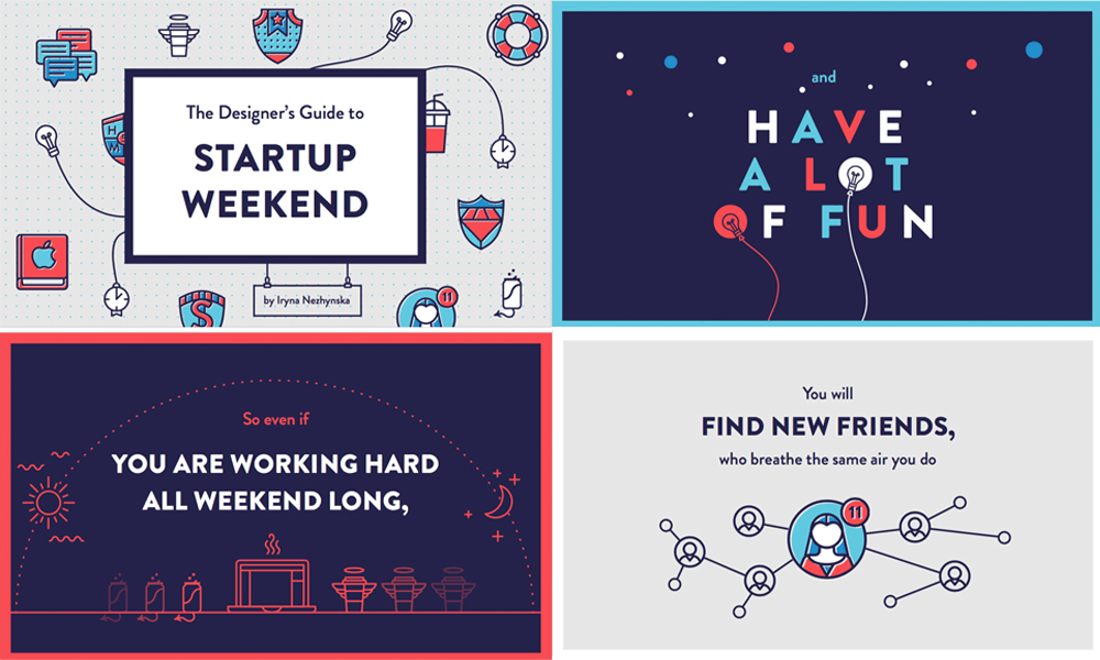
Source: Iryna Nezhynska
Each slide should talk to each other
The primary rule of designing a seamless and impressive presentation is consistency. If you follow a completely different style or approach in each page, you will end up with a distracting presentation.
If you prepare a completely different design for each page – disregarding the content and subject of the pages, you will get a disorganized and amateur result. This, in turn, prevents you from attracting the audience, being remembered and influencing the audience in the direction of your goal.
When preparing your presentation, you can design a master slide that will represent your brand in the best way. Basically this is an important step in ensuring consistency, but not the whole thing. Make sure that all visual objects, such as fonts, colors, photos, and videos, are in the same style and support each other.
Find more detailed information on consistency in this article which I have already posted.

Source: www.shutterstock.com
A picture is worth a thousand words
Photography is one of the best ways to make your presentation seamless and impressive. Because it is perceived at a rapid pace, it prevents distraction and delivers the message you want to deliver in the strongest way. Of course, with the correct photo selection and correct photo placement…
It is useful to take a considerable amount of time to choose a photo instead of using the first photo you see just because you need a photo on the page. Keep in mind that the photos you use works to complement the information you give and to enable the audience understand you more easily.
When choosing a photo, use original photos of your own brand, if possible, instead of cliché stock images. If this is not appropriate or possible for your presentation, take care to ensure that each photo you use is consistent with each other as we have just mentioned. For example, if you have placed a black and white Retro photo on one page, do not use a caricatured drawing on another page for the sake of continuity.
You can have a look at this post for detailed information about using photography.
Source: www.webdesignstuff.co.uk/
If not readable, text is not significant
The most important issue when it comes to typography is to have readable content. You need to include memos in your presentation to write readable presentation content rather than long sentences. Otherwise, people try to read the text on the screen while trying to listen to you simultaneously. After a while, they can even stop listening and just focus on what they see on the screen to read the whole thing. This makes neither text nor your presentation more significant.
In terms of readability, choosing the right font is crucial in order to make a strong presentation. To select a font that reflects your style and adds spirit to your presentation, set the impression you want to create before you start searching. This makes it easier to find what you are looking for without getting lost among hundreds of fonts. Do you want to look professional and serious or modern and sincere? There are beautiful fonts for each style. The important thing is knowing what you need.
When the subject is a font, you do not need to search for the most creative and different one. Each font has a spirit. It is not possible to put commonly used fonts in a position as generic photographs. Even if you have a font that you often see, when it is creating the effect you need, do not hesitate to use that font.
Another touch that will make the text easier to be read is the color selection. If you are using a dark background, choose a light text color (or vice versa). Make sure that there are not very colorful and complex images in the background where you place the text.
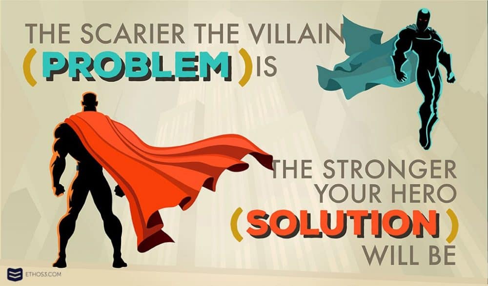
Source: www.ethos3.com
With stories, make a long-lasting impact
Generally speaking, the flow of presentation is very important. Your chance to influence the audience increases if you tell a story about what you want to deliver, because the stories touch people’s lives and make it easier to interact. The presentation design that supports your story has an important role to make a long lasting impact.
Pulling the audience in an impressive story rather than the information overload is a must for a successful presentation. As a matter of fact, we see that the most successful business people are wonderful storytellers.
The useful tricks of storytelling are to present a problem that needs to be solved, to offer a solution to overcome this problem, and to inform the audience about how the solution will be applied. When you visually support all these steps through your presentation, you can make the people believe in your words. Try to be sure that there are no gaps in your problem and solution in the story. So you can really influence the audience.
Source: www.vobjem.ru
Do not play all the trumps to influence people
This may sound difficult for some non-professional presentation designers. A page full of information, photos and data do not mean that you are giving a lot of information; and an empty page also makes you far away from being impressive. Well, what should we do?
The main problem here is not to have a clear understanding of how the presentation should look. Often, remind yourself that your presentation page is not the source of information, but a supporting element. Focus on what your content is will add value to your speech. If you give all the information in the presentation, the importance of the speaker decreases. This is not a desire for any of us!
After you have defined the main headings of your presentation, add the keywords and the important points visually in the presentation page. Give the details only in the speech. Rather than filling the screen with a lot of photos, reinforce your visual expression with the message you really want to deliver. Try using as few and complementary visuals as possible.
Source: www.shutterstock.com
The bullets have already become old-fashioned
We mentioned earlier that you should not add long words or sentences in your presentation. On the other hand, using bullets with keywords and phrases takes a lot out of your presentation. Yes, a list with bullets at first glance may appear to have a distinctive feature. But it is not that simple!
The keywords you use in an integrated way with your design instead of bullets look much more impressive. Using bullets in presentations is now an old use. So, we have to tell you that this use will prevent you from reflecting zeitgeist.
Final words
I hope that the tips I have mentioned give you an idea for enriching your presentation. Through these tips, we aim to create a presentation that looks and works without errors. Briefly, you need to stay away from the ready-to-use templates for a presentation design that is free from mistakes and develop a design that is unique to you.
One of the most important elements of design is consistency. People only remember a presentation actually that are consistent and in a context in itself. Other steps to leave a mark are creating interaction through storytelling and strengthening your narrative with quality photographs and readable text. You can contact with me to get detailed information about 7 tips we mentioned or to share your ideas.