Good Composition Increases Emotional Interaction and Makes Your Presentation Flawless.

You probably have heard of the saying, “A picture is worth a thousand words”. Photos with a good composition are the strongest visual feature to keep these words in mind. The human mind is better to remember narrated information; and it emotionally interacts easily with stories. Thus, your presentation gets a character that will last a long time in memory.
Using the right composition in the theme frame you specify makes it easier to perceive photos as information rather than data bombardment. Photos which help you to add a narration to your presentation will become reminder item marks when the presentation ends.
Well, what is the perfect composition? How does the composition affect the presentation? Let’s take a closer look together.


For a balance that sticks in the mind: Asymmetry
A photograph set in a symmetrical unity can be functional and effective in some uses, while on the other side it can interact strongly with emotions thanks to the realistic and natural impression it has in the structure. Asymmetry with a successful composition provides an image that cannot be forgotten, especially for those who want to create a unique balance. As an unexpected image asymmetry surprises, directs, motivates the audience. If you need natural dynamism and excitement in your presentation, contrary to the harmonious, calm and quiet structure created by symmetry, I recommend you to take the advantage of the asymmetry of the photograph you use.
Functional and powerful element: Whitespace
All areas of the photo you are using need not be full. On the contrary, when the photo has a white or neutral area, it creates an impressive contrast to the rest of the visual and makes up a background for the highlighted element. What is more? There you have a great space for text in the photo. You can create harmony by placing the titles or data you want to attract attention in your presentation.
To create the emotion you want: The point of view
The point of view determines where the photographer will position themselves. The effects of a photograph taken at the top of a mountain to see the skirts and another looking towards the summit from the foothills of the mountain will never be the same. The point of view of the photographer changes the whole meaning. As a result, you can see that everyday items or scenes become remarkable and original. The point of view is a technique to use especially by those who want to give a message of ‘power’. You will understand what I mean when you see photos taken by different techniques such as bird’s-eye view, worm’s eye or eye level shot!
To create depth effect: Perspective
The works created by photographers who are successful in perspective create a dramatic depth effect on two-dimensional images. For example, a photograph of a long path leads to a sense of continuity depending on the correct perspective. Such photos can be of use when talking about the future. And with the perspective, you can direct your audience to a different approach to what you want to draw attention to. This keeps the attention of the viewer on you by accelerating to interact with the photo used in the presentation.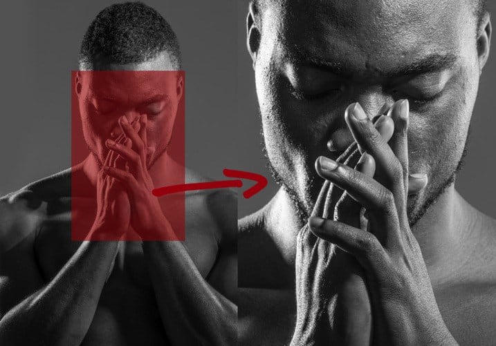
To enrich with details: Crop
When you use a very ordinary image of daily life with a highlighted meaning, you will be able to win the audience’s heart. You can try to crop photos for that. Close-ups or the cropping of a particular part of a photo often helps to make your presentation impressive by revealing interesting details that we never realize. It may be more tempting in some cases to see part of the object closely than to see the whole part of the object.
To support emphasis: Background
Create a contrast between the background and the most interesting point of the photo. The harmony of the background and the element to be emphasized must support the focus and emphasis, rather than being distracting. When choosing a photo for your presentation, be sure to take care of this. On the other hand, when you include an interesting element in your presentation, you can use the same background color as the background of the presentation to provide integrity.
The depth of field or focal point
The depth of field can be defined as the area that will be clearly visible in a photograph. A photograph with composition in the right depth of field affects your presentation in a positive manner not only aesthetically but also functionally. When the depth of field is used correctly, it adds an unforgettable accent to the photo. For example, you can help focus on the important part of a photo by blurring the less important section. The right focal point ensures that the audience notices the point you want to emphasize.
For a dynamic presentation: Motion
Photography does not mean a constant moment. A photo of a moving object or a person gives a dynamic effect to your presentation. You may need such a dynamism in your presentation! Include photographs that involve motion particularly at points where your speech starts to go monotonously. This makes the presentation more enjoyable and dynamic for audience.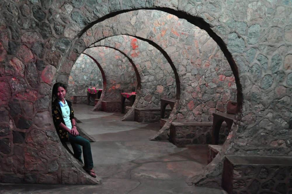
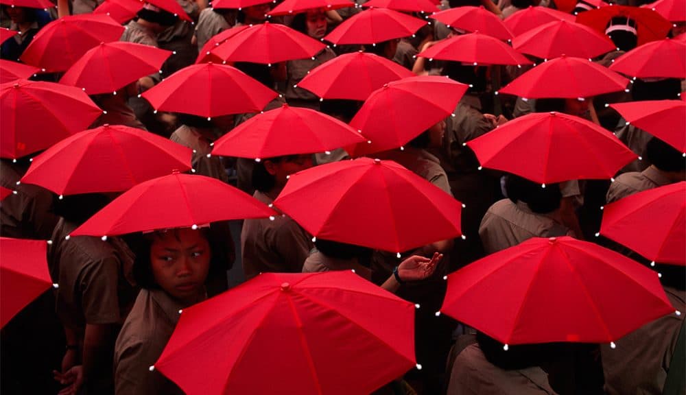
To attract attention: Rhythm
Using rhythm in photography allows you to emphasize the point you consider important. So you have the chance to attract attention and interest to the subject you tell the audience. Repetitive images are eye-catching in nature. If you do not want your audience to take their eyes off of the presentation, make absolutely use of such photos. When you want to make a striking impact, manipulating these repetitive patterns can be a unique method!