Though the limits of the human brain surprise us, we can remember 30% of what we see, around 20% of what we hear and read. Contrary to what we learned during school years; our eyesight that has much more wonderful talent than to see the light reflected through the object cannot go beyond being a watcher. At this very point, the difference between seeing and looking and also John Berger’s cult work ‘Ways of Seeing’ comes to my mind.
While looking is a passive witnessing we experience through our eyes, seeing is a common activity by our mind and our eyes. This is the moment when data turns into stories, the stories into patterns, and the patterns into the messages leaving marks in our memory; and also when we need to start helping our minds to make these messages permanent.
Well, what can you do about it?
Despite common knowledge, data visualisation, that means more than drawing graphics has three basic building blocks: Data, Visual and Story. This abstract triplet, which enables us to keep information in our long-term memory, transforms confusing data into easily digestible information and delivers the message you want to give directly to the memory of the audience. When graphics are presented in a particular story or context, they become unique tools to convert data that seem boring at first glance into traceable and memorable info.
Why data visualisation?
Visualising the data not only makes the information memorable and understandable, but it also becomes your biggest help in critical issues such as making your message interesting and establishing an effective business communication. Visualised data can add excitement to your presentation, support your ideas and provide a much more persuasive speech.
Those who have made a few presentations so far know that they cannot project just an Excel file on the screen. Consider a presentation in which annual budget targets, financial information, social media data are presented in hundreds of numbers. A data overload that the audience, even the presenter can get lost and bored… In this case it will be very difficult to keep the pot boiling. Who wants to be the person on stage in this case?
Now, imagine a presentation that you can understand and interpret at first glance how visuals make up the story, how the figures communicate with each other, how far you’ve progressed this past year, how much more visible you are in social media, or in which areas you need to work harder, and even that you can begin to project the upcoming days right there. I guess I would prefer this one.
In short, the data is not your enemy. On the contrary, it could be one of the weapons you can use to influence people.
In a previous year, I have already share tips to engage listeners more in your presentation. Now, let’s go deeper and talk about the features of attractive graphics.
Source: www.flickr.com/photos/gianordoli
Create a strong focus
What do you want people to see in the graphic you present? What parts of your chart should never be overlooked? The main purpose of the design is to place the answers to these questions in the centre of your visual, graphic or infographic because infographics can become a mess of text and graphics in case when they don’t have a strong focal point.
If you lose control over visualising data, you may come across a design that is more distracting from its ultimate purpose, making it more complicated than it is. One way to manage this trend is to use a single, central graphical element that communicates with your overall concept and message. You can take advantage of contrasting colors and fonts or positioning your images. So people look right wherever you intend them to look at. And, they can perceive your message as you want.
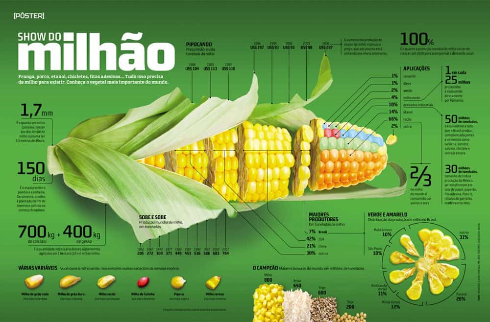
As you can see, the attractive corn visual on this page draws on the viewer with its strong focus created despite the disadvantage of the majority of the page being covered, and it is laying the groundwork for visualising the data to be conveyed. It also gives you great support to visualise the data in a systematic way with the infrastructure created to classify data.
Source: www.norwood.org.uk
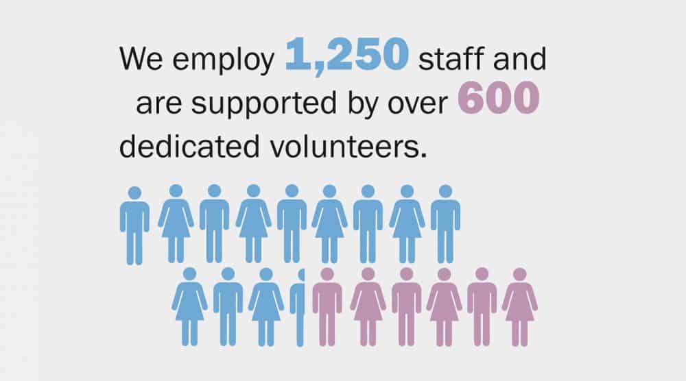
Get closer to simplicity
Companies such as Apple and Google, which have become world giants, have always preferred simplicity in design. Simplicity comes out as one of the most important issues when it comes to data visualisation. Do not forget that we do not target to make a show while visualising the data, but to transmit the message and the data with the least loss. For this reason, be as simple as possible. What they say: ‘less is more’.
When you are preparing your graphics, you do not need to include every piece of information that comes to mind. Avoiding each element that distracts the audience from data visualisation brings us one step closer to the goal. Our eye does not look after an order by its nature. The more elements that stand out in the design, the more points the eye wants to look at, and the focal point loses.
It is your benefit to ensure that the eyes are moving in order… For that, you must present the information in a systematic format wherever possible. And remember that you should avoid using more than three different fonts and more than four different colors.
With simple graphics, reveal the main thing that is important to your presentation, that is, the data itself
Source: Canadian Space Agency
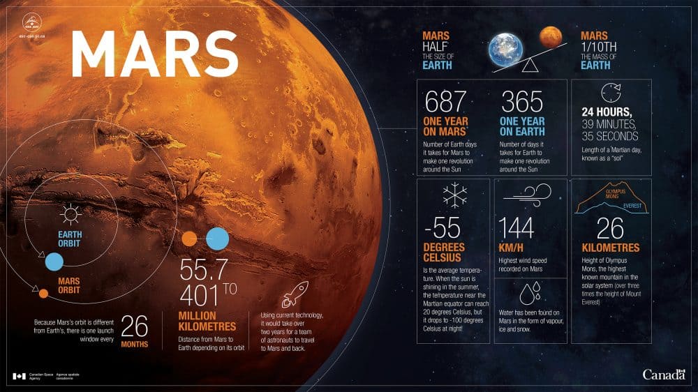
Set a theme and use the power of storytelling
In terms of both visual and narrative, loyalty to a particular theme while transforming the audience into a graphical view adds integrity to your presentation. So the audience can more easily perceive the data you are giving. Suppose you prefer space-themed graphic design. You can position your company’s branches as planets, and you can express numerical values by associating them with values such as the lifespan of planets or their distance to each other.
For example, if you need to mention a length of 12,000 km, it is much more effective when you use the phrase “Almost like a round trip around the world”. It is a necessity not to skip this method, especially when you transfer financial figures and mass-specific figures to the listener. Otherwise, the numbers you give may not mean much to them. For example, instead of expressing the number of products produced in our factory in number, you could say, “We have produced enough products to meet the needs of the entire Ankara population in one year.”
In this way, the data you present can turn into a story that the audience can associate with. Moreover, the appropriate visuals with thematic narratives attract the audience’s attention to you. If you make your presentation around an interesting theme, you will have a narrative and contextual integrity.
Source: www.flickr.com
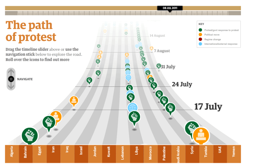
Visualise comparisons carefully
You can determine what the audience will focus on through your design. If you are aiming to visualise a comparison with your graph, this topic gains a different dimension. For example, when you are telling the increasing sales rates over time, if you visualise the difference carefully, you can commit the changing rates to memory of the audience.
You need to create the right categories for the right design. You can then specify a hierarchy between these categories, or you can decide how you want to sort within the category. In the next step, you have to investigate the way to give the comparison in the most clear and remarkable way.
For example, when we look at the graphic above, we don’t see everything at once, but instead we focus on specific points. You can show the comparison that is enabled with the strong contrast between red and gray in this graphic using many different features such as big-small, near-far, dark-light. The better you visualise these contrasts, the clearer your comparisons become.

Source: www.ryanmaceachern.com
Relate your graphics to content and audience
It makes your job easier to use objects from everyday life as graphical elements in your presentation. Such graphical elements help the audience get familiarise with your presentation because when the elements you use to transform the data into graphics intersect with the personal life of the audience, the content of your presentation also participates in this intersection. Your presentation becomes more remarkable and enjoyable. It makes a difference enabling it to be permanent.
Relate the content with the graphics you use so that you can catch the audience’s attention. Standard graphic designs can be easily done using a few bars or a cake slice template. But we have to admit that these graphics can draw less attention and make a relatively less powerful presentation in discourse.
Moreover, it is not hard to imagine the relationship between your content and your audience. For example, you can use a parasol that consists of slices of different colors that give the number of visits to the destinations of your holiday company. Or, in a presentation on healthy life and diet, you can create your charts from foods that are also parts of our daily life. This kind of visual manipulation allows the audience to enjoy your presentation.
Source: www.guardian.co.uk
Use the correct graphic format
It is also important to use the graphic in the correct form as well as to use graphics in presentation. Graphics can be considered as the weapon of the message to be conveyed; the key of the door that will meet you with the audience. As we said at the beginning, seeing comes at the top of our senses, which make it easy to remember. Nevertheless, remember that you are in charge to increase the power of the visuals to be remembered, anyways.
Try to explore the graphical format that is appropriate for your presentation. For example, if you are talking about the development process of something in time, it would not make much sense to visualise it in the pie slice format. Instead, you can design a chart with a timeline. Create your own original graphic format with care to stay within a certain context or theme.
On the other hand, paintings or drawings can also work. If you have the possibility, you can convey your message in the most appropriate way with a unique graphic that reinforces your message. Go beyond the templates and dig into the audience’s eyes with the visuals that support and enrich your story.
Final words
Listening to the transmission of the data can be tedious for most people. If you convert the data into attractive graphics, it changes the entire atmosphere of the presentation. On the other hand, accurate visualisation is also important to ensure that interpretations are always interpreted correctly. At the beginning of the crucial issues for proper visualisation, it is necessary to direct the audience’s focus to the right place.
Simplicity plays a key role at this point because it helps to clarify the message you want to give as well as support your focus. With a graphic that you can narrate around a theme, you can draw the attention of everyone. Moreover, the information is imprinted on their minds when you are able to relate your graphics to both your content and your audience.
With the correct graphics, you are ready to present your data to the audience when you are sure you are giving the right message!

Presentation / Mar 21, 2024


Presentation / Aug 02, 2023

Presentation / Jun 16, 2023