In our days, amazing people image wise and sticking in their minds is a very difficult process. Owing to the magnificent dynamism in designing world, images used on billboards TVs websites lose their uniqueness and become ordinary. Thus focusing the audience on the slogans, products, campaigns designed gets harder day by day.
No matter how important the message that we want to send, if we can’t attract the audience, it would probably and mostly feel weak. The most significant issue about presentation is already that we can create a concrete and durable image in minds of people. We should remember the saying “what you tell is important, and also how you tell” and let me share 5 most impressive basic designing principles.
You’ll notice the difference instantly when you pay attention to these 5 principles of powerful presentation designing.
Source: Kevin Barber
Color Choice
The effects of color on humans is scientifically proven fact and we all know it. Colors are radically effective because of strengthening the memorability, directly affecting the senses and feelings, defining the mood and energy of the audience and design continuity. You should be careful about your choices on color in designing process of presentation.
Should the photos you use be black and white or colored? Which colors are suitable for our presentation? What color palettes can be used and still feel corporate identity? To answer all these questions we can check which color affects our brain in what way: red: energy and instancy, yellow: optimistic and young in soul, green: abundance and relaxation, blue: safety and trust, black: a strong impression, white: balancing.
Color harmonies that are created by thinking how colors affect each other physically is key to corporate identity related designs. Because of that, we should be aware of the feeling the color gives and how it’s perceived.
Color wheels are helpful when it’s time to choose colors for your designs. Opposite and complementary colors are placed against each other. You can use these color pairs. With a light text such as yellow or white, you should use a dark background, so that it pops the text out. Also, the brightness and tone of the color changes the whole feeling the presentation gives. After choosing the right colors to convey the feeling according to your sector, chosen colors should be hierarchically balanced.
Source: Jon Brousseau
Size
Human psychology shows compatibility and tendency to contrasts in size. In an arrangement integrity-separation, effectiveness-ineffectiveness, compatibility-incompatibility and depth differences largely attracts the audience. Because of that you should consider the sizes of the images, fonts, icons and you should consider how they’re placed.
When scaled correctly, images, fonts, and icons add design emphasis, emotion and hierarchy. Using a item that you think is more important larger helps you draw more attention by highlighting this item hierarchically. Typographic interpretations created by the use of size may even suffice to highlight your texts without using extra icons or illustrations.
Source: Iryna Nezhynska
Continuity
Slides that follow each other in a visual context, i.e. with continuity, provide you with a sense of coherence that you will always start the game 1-0 ahead. The communication between icons, colors, background images, fonts, frames, and logo placements is the unique dynamic that actually constitutes the backbone of the entire design. For example, using illustrations or 3D objects on subsequent pages while using photographic images as infographic elements in the first three pages can distort the presentation’s sense of integrity.
On the other side, you can provide continuity with similar color and technically designed icon sets. If your photos have color differences, you can make a connection by taking advantage of filters. Filters are one of our best friends with integrity.
With the continuity, you ensure that people got the message very easily because you provide a connection between different components. In this way, you not only connect different components but also catch a continuity and coherence which makes it look more professional.
A loose and discontinuing presentation design can cause the audience to feel very disconnected.
Empty Space Usage
One of the frequently made mistakes is filling up all possible spaces. When we do that, it can be confusing and distracting causing the audience miss the important message. Instead of this, including only the important parts in presentation or preparing a matter related slide would be the right choice.
Hierarchically defining the important parts and placing significant facts in certain order makes your presentation more successful. A right empty space usage is a key to the balance of the presentation. For example, to balance the stain weight of the image you use you can place some infos that you think the audience can be interested. So, you get to balance your background and also create a powerful presentation that consists of related elements.
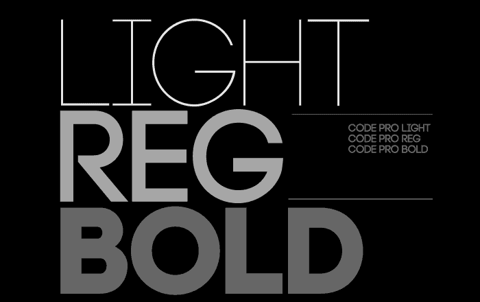
Font Choice
Font choice and typography of design determines the remarkability and clarity of the message. Moreover, with the right fonts, you can attract the audience.
When it comes to the fonts, the most basic rule is that you shouldn’t use more than two different fonts in one page. You can find many tools showing you which font goes with the other. If you want to use a decorative font, using it with a simple sans serif can be useful.
There are some tips that I think might be helpful for you about fonts:
Conclusion
Designing can be learned from others and built up by yourself. The more you practice the better you can see how the design should be. Along with all these tactics, you should be brave and act free as well. Try to understand all the information about designing in this piece and in other sources. Thus, you’ll be able to recognize which rule makes your presentation better in which time. To build a designer perspective inspect each design under different rules and techniques. Try to see which designs are attractive to you and which colors and fonts you use evoke feelings.
In distracting designs, evaluate the texts and image balance and analyze the empty spaces as to they’re correctly placed. Remember that consistency and continuity is important. Check the disconnections keeping you away from focusing.

Presentation / Mar 21, 2024


Presentation / Aug 02, 2023

Presentation / Jun 16, 2023